Client & project
A corporate training programme delivered as a 55-slide presentation. The content was the product — the client's expertise, structured into a curriculum — and it was being let down by the slides carrying it.
The challenge
Long decks fail differently from short ones. A twelve-slide pitch can survive inconsistency; a fifty-five-slide programme cannot, because inconsistency compounds. By slide thirty an audience has stopped trying to work out where to look.
The specific problems were the ones we see in nearly every long deck built incrementally by several people over time: no shared type scale, so emphasis meant nothing; text volumes that asked the audience to read while the trainer talked; and section transitions that gave no sense of structure or progress.
The objective
Make a long programme navigable and teachable: consistent enough that the audience stops re-orienting on every slide, and structured enough that they always know where they are in the curriculum.
Our approach
A system, not fifty-five decisions. We defined a small set of slide archetypes — section opener, concept, process, data, example, summary — and rebuilt every slide as an instance of one. That is what makes a long deck feel authored rather than assembled.Text reduced, meaning kept. Body copy was cut substantially, with the detail that mattered moved into speaker-facing notes rather than deleted. The slide supports the trainer; it does not replace them.Visual hierarchy per slide. One dominant element, consistently placed, so the eye lands correctly without conscious effort.Navigational structure. Section markers that let a learner three hours in still know which module they are in.Scope of work
- All 55 slides redesigned
- Slide archetype system defined and applied
- Consistent type scale, palette and iconography
- Content reduction with meaning preserved
- Section structure and navigation cues
- Editable master file the client's team can extend
Before & after
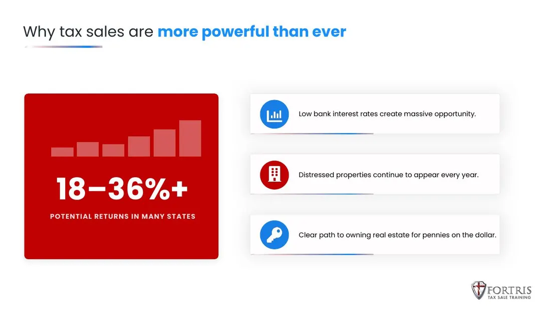
Below are matched slides from the original and redesigned programme. The content is the client's throughout — what changed is how quickly it can be understood.
Outcome
The client received a complete redesigned programme plus a reusable system, so future modules start from a defined structure rather than a blank slide. We publish only what we can substantiate: scope and deliverables. We have not been given learner-outcome metrics for this programme and will not invent them.
You can explore more of this project interactively on our Redesign Engine page, where six slide pairs from this programme can be compared side by side with a drag slider.